On This Page:
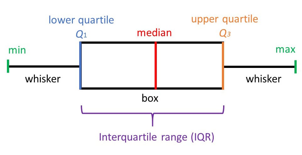
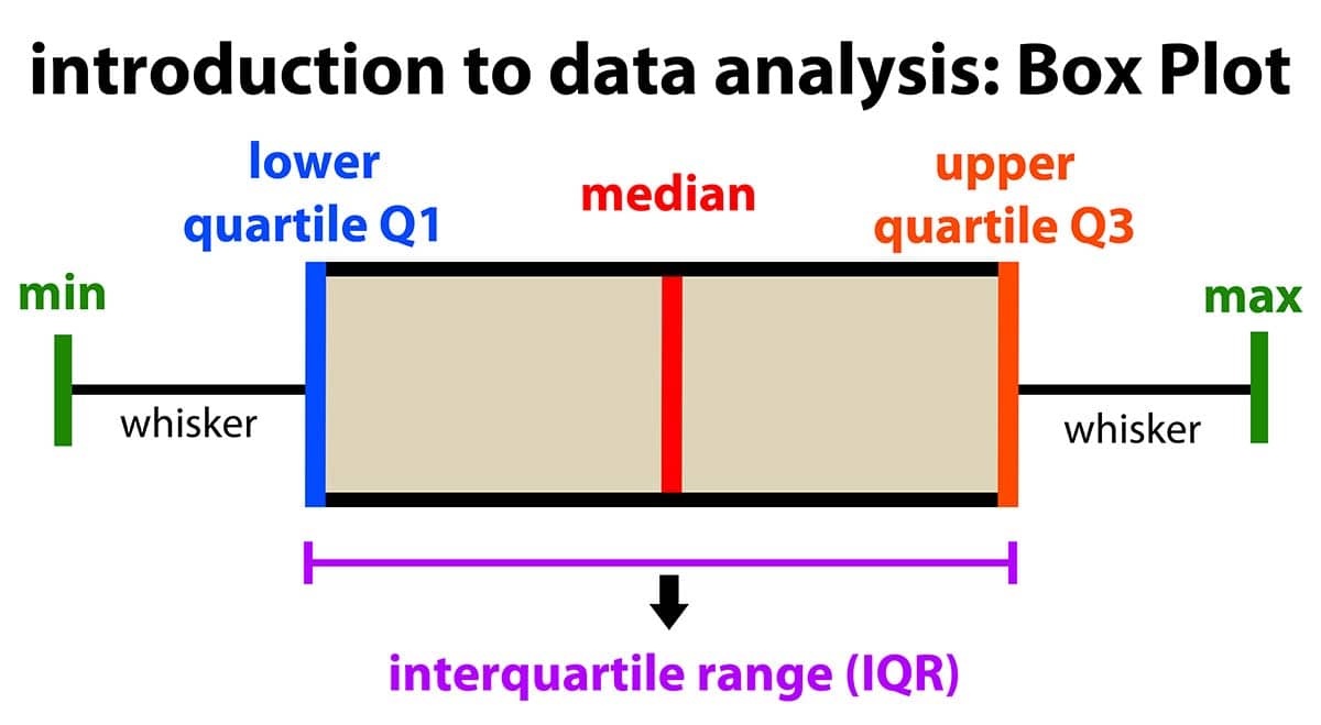
Box plots show the five-number summary of a set of data: including the minimum score, first (lower) quartile, median, third (upper) quartile, and maximum score.
Definitions
Minimum Score
The lowest score, excluding outliers (shown at the end of the left whisker).
Lower Quartile
Twenty-five percent of scores fall below the lower quartile value (also known as the first quartile).
Median
The median marks the mid-point of the data and is shown by the line that divides the box into two parts (sometimes known as the second quartile). Half the scores are greater than or equal to this value, and half are less.
Upper Quartile
Seventy-five percent of the scores fall below the upper quartile value (also known as the third quartile). Thus, 25% of data are above this value.
Maximum Score
The highest score, excluding outliers (shown at the end of the right whisker).
Whiskers
The upper and lower whiskers represent scores outside the middle 50% (i.e., the lower 25% of scores and the upper 25% of scores).
The Interquartile Range (or IQR)
The box plot shows the middle 50% of scores (i.e., the range between the 25th and 75th percentile).
Why are box plots useful?
Box plots divide the data into sections containing approximately 25% of the data in that set.
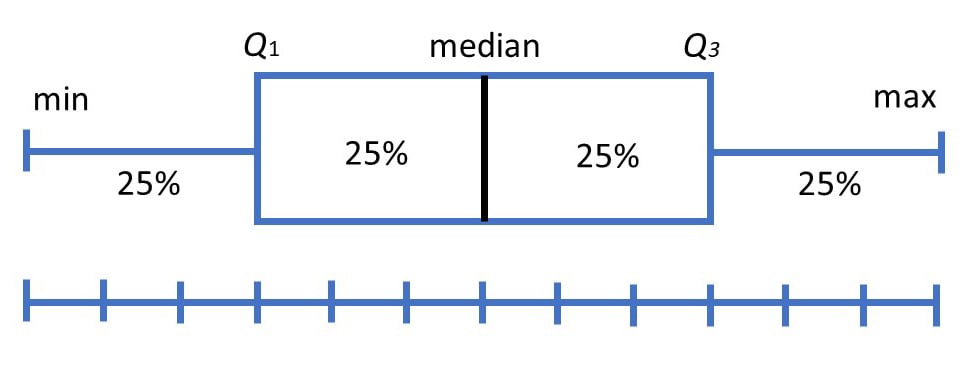
Box plots are useful as they provide a visual summary of the data enabling researchers to quickly identify mean values, the dispersion of the data set, and signs of skewness.
Note the image above represents data that is a perfect normal distribution, and most box plots will not conform to this symmetry (where each quartile is the same length).
Box plots are useful as they show the average score of a data set
The median is the average value from a set of data and is shown by the line that divides the box into two parts. Half the scores are greater than or equal to this value, and half are less.
Box plots are useful as they show the skewness of a data set
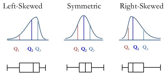
The box plot shape will show if a statistical data set is normally distributed or skewed.
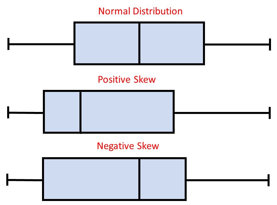
When the median is in the middle of the box, and the whiskers are about the same on both sides of the box, then the distribution is symmetric.
When the median is closer to the bottom of the box, and if the whisker is shorter on the lower end of the box, then the distribution is positively skewed (skewed right).
When the median is closer to the top of the box, and if the whisker is shorter on the upper end of the box, then the distribution is negatively skewed (skewed left).
Box plots are useful as they show the dispersion of a data set
In statistics, dispersion (also called variability, scatter, or spread) is the extent to which a distribution is stretched or squeezed.
The smallest and largest values are found at the end of the ‘whiskers’ and are useful for providing a visual indicator regarding the spread of scores (e.g., the range).
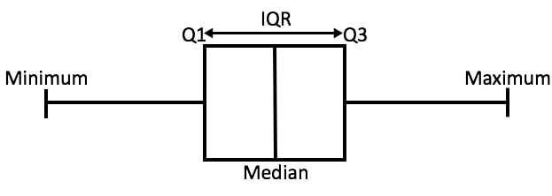
The interquartile range (IQR) is the box plot showing the middle 50% of scores and can be calculated by subtracting the lower quartile from the upper quartile (e.g., Q3−Q1).
Box plots are useful as they show outliers within a data set
An outlier is an observation that is numerically distant from the rest of the data.
When reviewing a box plot, an outlier is defined as a data point that is located outside the whiskers of the box plot.
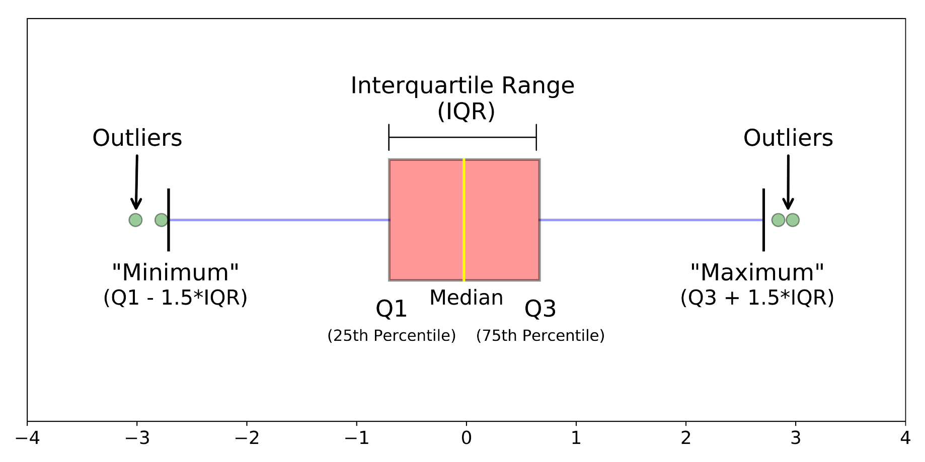
Source: https://towardsdatascience.com/understanding-boxplots-5e2df7bcbd51
For example, outside 1.5 times the interquartile range above the upper quartile and below the lower quartile (Q1 – 1.5 * IQR or Q3 + 1.5 * IQR).
How to compare box plots
Box plots are a useful way to visualize differences among different samples or groups. They manage to provide a lot of statistical information, including — medians, ranges, and outliers.
Step 1: Compare the medians of box plots
Compare the respective medians of each box plot. If the median line of a box plot lies outside of the box of a comparison box plot, then there is likely to be a difference between the two groups.
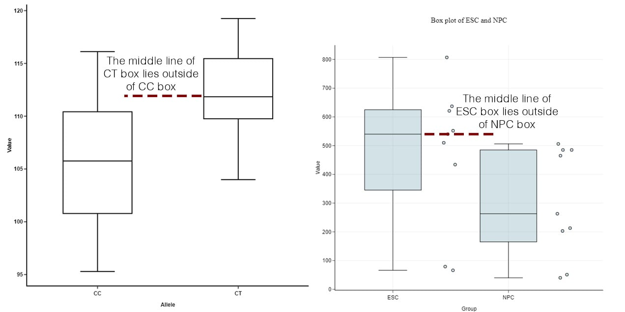
Source: https://blog.bioturing.com/2018/05/22/how-to-compare-box-plots/
Step 2: Compare the interquartile ranges and whiskers of box plots
Compare the interquartile ranges (that is, the box lengths) to examine how the data is dispersed between each sample. The longer the box, the more dispersed the data. The smaller, the less dispersed the data.
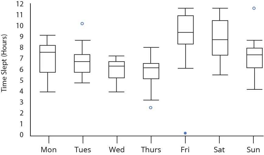
Next, look at the overall spread as shown by the extreme values at the end of two whiskers. This shows the range of scores (another type of dispersion). Larger ranges indicate wider distribution, that is, more scattered data.
Step 3: Look for potential outliers (see the above image)
When reviewing a box plot, an outlier is defined as a data point that is located outside the whiskers of the box plot.
Step 4: Look for signs of skewness
If the data do not appear to be symmetric, does each sample show the same kind of asymmetry?
